Layout Package
🛠️ Component Overview


Welcome to the Component Overview page! This section provides an in-depth look at the various Layout components included in our package. Each component is designed to enhance your application's user experience by offering consistent and reusable building blocks for authentication flows.
Available Components
Our package features six primary types of components that facilitate the development of Unauthorized routes:
- Layout Components: Versatile layouts for authorized routes, allowing for different visual arrangements.
- Utilty Stores: Stores that will allow you to configure layout values from different components or pages.
- Breadcrumb Components: Nicelly designed breadcrumb compoenents.
- Sidebar Components: Different types of sidebar components.
- Header Components: A wide configuration range for top heading navigation.
- Footer Components: Different styles of footer navigation components.
Additionally, each component is equipped with multiple slots, making it straightforward to customize and adapt the components to your specific application needs.
These components are directly connected to the layout.yml, header.yml, sidebar.yml, hamburger.yml, and footer.yml files, allowing you to configure various settings, including layout options and component behavior.
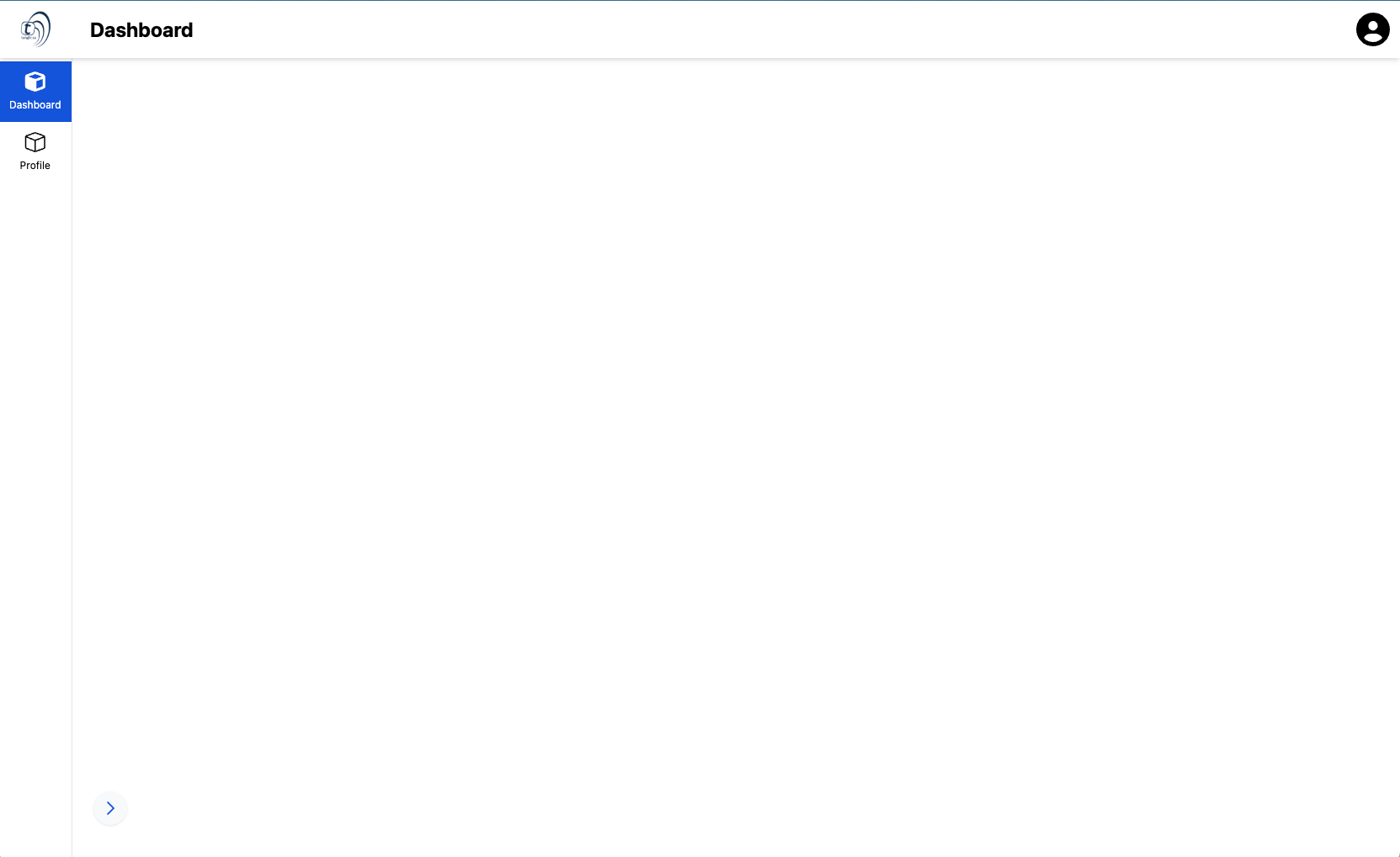
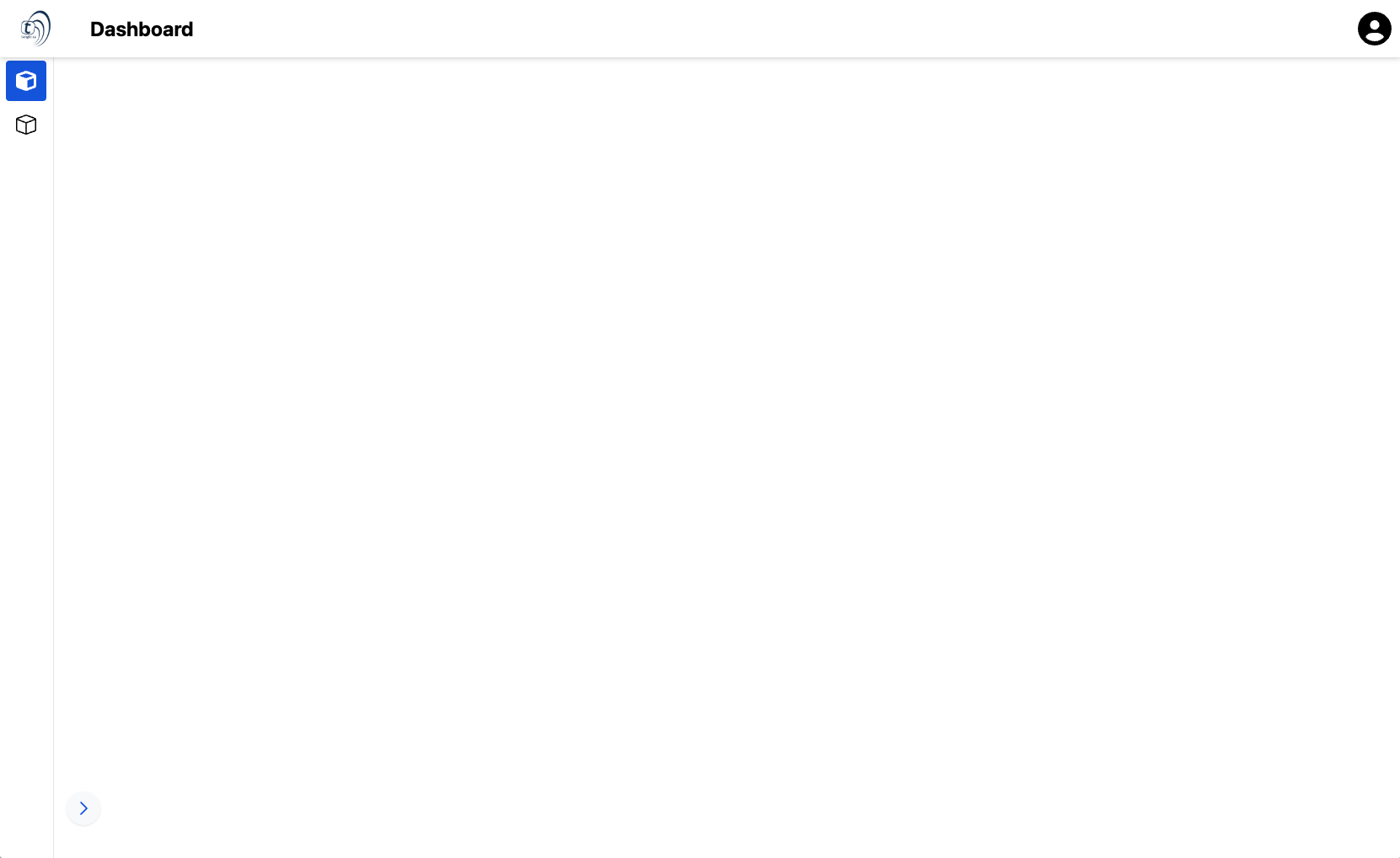
Layout Components
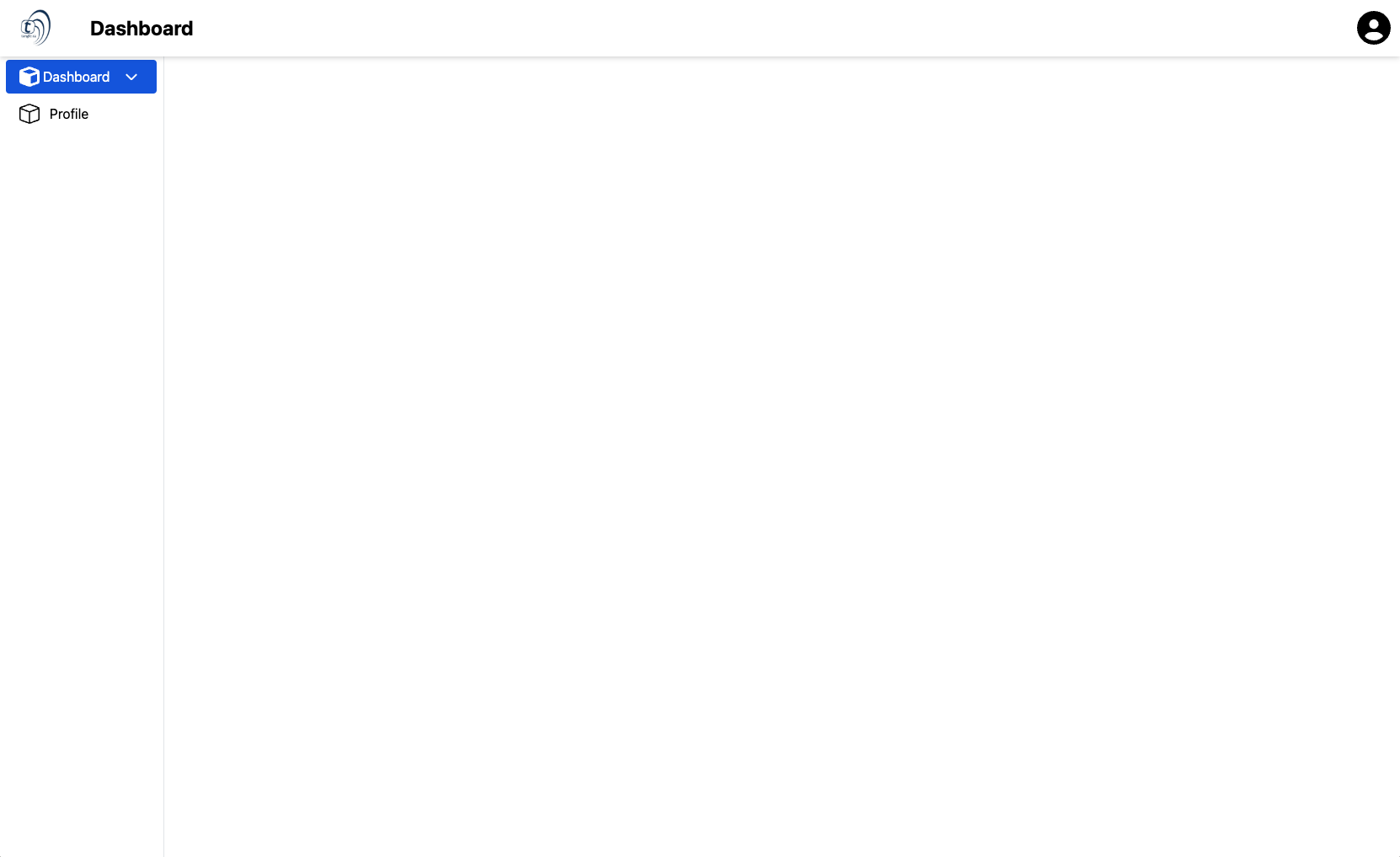
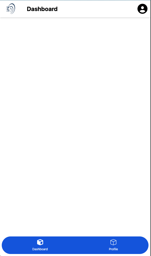
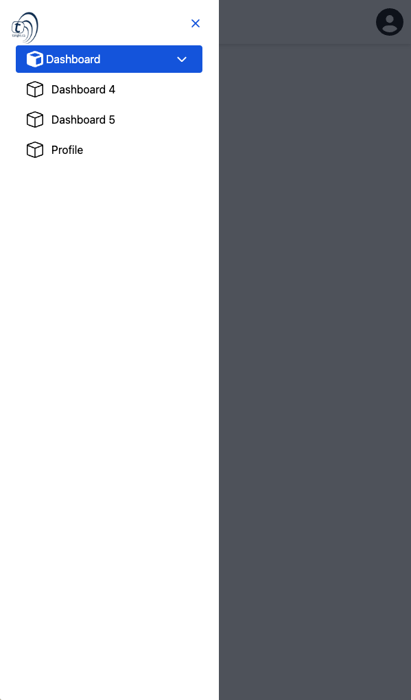
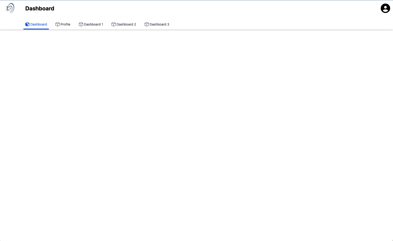
AppLayout
The <AppLayout> component serves as a foundational wrapper for your authorized routes, reshaping the screen to enhance user interaction without cluttering the screen with additional elements. It should be implemented in the +layout.svelte file of your (app)|(authorized) route group.
Slots
header: This slot is for the header section and header navigation section of the layout.hamburger-icon: This slot is for the hambuger menu icon, which by default is 3 horizontal lineshamburger-drawer: This slot is for the drawer component, which by default is a Drawer component from Flowbite-Sveltehamburger: This slot is for the hamburger menu, which by default is a button that will open the drawer.before-logo: This slot is responsible for displaying anything on the left side of the logo, which by default is nothing.logo: This slot is responsible for displaying project's logo.after-logo: This slot is responsible for displaying anything on the right side of the logo, which by default is nothing.center: This slot is responsible for displaying anything on the center of the header component, which by default is nothing.right: This slot is responsible for displaying anything on the right of the header component, which by default is the profile button.sub-header: This slot is responsible for displaying the subHeader component.subheader-left-side: This slot is responsible for displaying anything on the left side of the subHeader component, which by default is the title and the description.subheader-title: This slot is responsible for displaying the subHeader title.subheader-description: This slot is responsible for displaying the subHeader description.subheader-right-side: This slot is responsible for displaying anything on the right side of the subHeader component, which by default is nothing.header-navigation: This slot is responsible for displaying the header navigation. which by default is the header navigation component.header-navigation-list: This slot is responsible for displaying the header navigation list items.header-navigation-extra-info: This slot is responsible for displaying extra information on the header navigation component.sidebar: This slot is responsible for displaying the sidebar component.app-sidebar-left-minimal-top: This slot is responsible for displaying extra information on the top of the left minimal sidebar items component.app-sidebar-left-minimal-bottom: This slot is responsible for displaying extra information on the bottom of the left minimal sidebar items component.app-sidebar-left-minimal-center: This slot is responsible for displaying extra information on the center of the left minimal sidebar items component.app-sidebar-left-default-top: This slot is responsible for displaying extra information on the top of the left default sidebar items component.app-sidebar-left-default-bottom: This slot is responsible for displaying extra information on the bottom of the left default sidebar items component.app-sidebar-left-default-center: This slot is responsible for displaying extra information on the center of the left default sidebar items component.app-sidebar-left-detailed-top: This slot is responsible for displaying extra information on the top of the left detailed sidebar items component.app-sidebar-left-detailed-bottom: This slot is responsible for displaying extra information on the bottom of the left detailed sidebar items component.app-sidebar-left-detailed-center: This slot is responsible for displaying extra information on the center of the left detailed sidebar items component.app-sidebar-right-minimal-top: This slot is responsible for displaying extra information on the top of the right minimal sidebar items component.app-sidebar-right-minimal-bottom: This slot is responsible for displaying extra information on the bottom of the right minimal sidebar items component.app-sidebar-right-minimal-center: This slot is responsible for displaying extra information on the center of the right minimal sidebar items component.app-sidebar-right-default-top: This slot is responsible for displaying extra information on the top of the right default sidebar items component.app-sidebar-right-default-bottom: This slot is responsible for displaying extra information on the bottom of the right default sidebar items component.app-sidebar-right-default-center: This slot is responsible for displaying extra information on the center of the right default sidebar items component.app-sidebar-right-detailed-top: This slot is responsible for displaying extra information on the top of the right detailed sidebar items component.app-sidebar-right-detailed-bottom: This slot is responsible for displaying extra information on the bottom of the right detailed sidebar items component.app-sidebar-right-detailed-center: This slot is responsible for displaying extra information on the center of the right detailed sidebar items component.footer: This slot is responsible for displaying the footer component.
Props
| Name | Type | Description |
|---|---|---|
navigation | Array<"sidebar" | "header"> | This is responsible to display the slots for sidebars navigation and header navigation, it is ["sidebar"] by default, or whatever value you have on the layout.yml, at the layout.display.navigation . |
display | "desktop" | "mobile" | This is responsible to do some small changes on the layout like adding a few more paddings, margins, as well as automatically displaying the footer on smaller screens, it is "desktop" by default, or whatever value you have on the layout.yml, at the layout.display.mode . |
displayHeader | boolean | This is responsible to add the header slot to the layout as well as change some margins and paddings, it is false by default, or whatever value you have on the layout.yml, at the layout.header.enabled . |
displayFooter | boolean | This is responsible to add the footer slot to the layout as well as change some margins and paddings, it is false by default, or whatever value you have on the layout.yml, at the layout.footer.enabled . |
displayFooterMobile | boolean | This is responsible to add the footer slot, only on smaller screens, to the layout as well as change some margins and paddings, it is false by default, or whatever value you have on the layout.yml, at the layout.footer.mobile . |
displaySubHeader | boolean | This is responsible to add the subHeader slot to the layout as well as change some margins and paddings, it is false by default, or whatever value you have on the layout.yml, at the layout.subHeader.enabled . |
subNavBarEnabledMobile | boolean | This is responsible to add the subHeader slot, only on smaller screens, to the layout as well as change some margins and paddings, it is false by default, or whatever value you have on the layout.yml, at the layout.subHeader.mobile . |
headerClass | string | This is responsible to add tailwind classes to the header slot, it is empty string by default. |
slotHeader | string | This is responsible to pass the header classes to the AppShell component, it is app-layout-slot-header by default. |
headerSpacing | string | This is responsible to add a top spacing for both the content and the sidebars to the header, it is empty string by default, or whatever value you have on the layout.yml, at the layout.display.spacing.header . |
sidebarLeftClass | string | This is responsible to add tailwind classes to the left sidebar slot, it is empty string by default. |
slotSidebarLeft | string | This is responsible to pass the sidebar left classes to the AppShell component, it is app-layout-slot-sidebar-left by default. |
sidebarRightClass | string | This is responsible to add tailwind classes to the right sidebar slot, it is empty string by default. |
slotSidebarRight | string | This is responsible to pass the sidebar right classes to the AppShell component, it is app-layout-slot-sidebar-right by default. |
footerClass | string | This is responsible to add tailwind classes to the footer slot, it is empty string by default. |
slotFooter | string | This is responsible to pass the footer classes to the AppShell component, it is app-layout-slot-footer by default. |
pageContentClass | string | This is responsible to add tailwind classes to the main content slot, it is empty string by default. |
slotPageContent | string | This is responsible to pass the main content classes to the AppShell component, it is app-layout-slot-footer by default. |
sidebarLeftContainer | string | This is responsible to change the tailwind classes of the div element that wraps over the left sidebar component, it is h-full by default. |
sidebarRightContainer | string | This is responsible to change the tailwind classes of the div element that wraps over the right sidebar component, it is h-full by default. |
logo | string | This is the logo to be displayed on the header, it is stockLogo by default. |
subHeaderBgImage | string | This is the background image to be displayed on the subHeader component, it is empty string by default. |
drawerLogo | string | This is the logo to be displayed on the drawer, it is stockLogo by default. |
displayProfileButton | boolean | This is responsible display or not the profile button on the header, it is false by default, or whatever value you have on the layout.yml, at the layout.header.profileButton.enabled . |
avatar | string | This is the avatar href of the user to be displayed on the profile button, it is empty string by default. |
name | string | This is the name of the user to be displayed on the profile button, it is empty string by default. |
email | string | This is the email of the user to be displayed on the profile button, it is empty string by default. |
iconHexColor | string | This is the color of the user avatar icon to be displayed on the profile button when no avatar is set, it is empty string by default. |
onLogout | (values?: unknown) => Promise<void> | This is responsible to run the logout function when the user clicks on the logout button on the profile button, it is empty string by default. |
headerTitle | string | This is a way to override the header title, it is empty string by default. |
Examples
All of the following examples have the same code on the +layout.svelte file, but they have different configurations in the .yml files.
LayoutSettings
The <LayoutSettings> component is a simple component that sets a few css varaibles to your DOM structure, as well as to your local storage.
<LayoutSettings> should be used as a wrapper component in your first +layout.svelte file of your routes folder.
All the <LayoutSettings> components does is it looks at the app.settings.primary_color, and the app.settings.accent_color values, it runs a constrast function and it sets the --settings-text-contrast-primary-color and --settings-text-contrast-accent-color values to be either black or white depending on the contrast with the colors.
Props
| Name | Type | Description |
|---|---|---|
viewport | string | This is responsible to set the viewport of your app, it is width=device-width by default, or whatever value you have on the app.yml, at the app.viewport . |
title | string | This is responsible to set the title of your app, it is My App by default, or whatever value you have on the app.yml, at the app.seo.title . |
primaryColor | string | This is responsible to set the primary color of your app as well as the theme color of the app, it is #4083f8 by default, or whatever value you have on the app.yml, at the app.settings.primary_color . |
secondaryColor | string | This is responsible to set the accent color of your app as well as the theme color of the app, it is #000 by default, or whatever value you have on the app.yml, at the app.settings.accent_color . |
textContrastPrimary | string | This is responsible to set the constrast color of your primary color, it is "#000" by default. |
textContrastSecondary | string | This is responsible to set the constrast color of your accent color, it is "#000" by default. |
Implementation Example
Utility Stores
The utilities stores from the layout package helps you manage and configure layout settings from anywher in your application. We have the following stores available:
- modal store
- breadcrumb store
- subHeader store
- drawer store
Modal Store
The modal store lets you display a modal screen easily and quickly, it can be a simple modal screen, or even a complex modal screen, since you can even pass a custom modal component to be displayed in it. Here's an simple example of a modal store:
Breadcrumb Store
The breadcrumb store lets you manually configure what your breadcrumb display, therefore overwriting the automatic configurations. Here's an simple example of a breadcrumb store:
SubHeader Store
The subHeader store lets you manually configure what gets diplayed on the subHeader component on whatever page you are, therefore overwriting the automatic configurations. Here's an simple example of a subHeader store:
Drawer Store
The Drawer store lets you manually manually open or close the drawer component on whatever page you are, therefore overwriting the automatic configurations. Here's an simple example of a Drawer store:
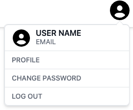
ProfileButton
The <ProfileButton> component serves as a ready to use profile button, user information button, and logout button.
This component is used by default on the AppHeader component, but if you need to make some customizations around the button or the header component, you might have to pass it manually to the AppLayout respective slot.
Slots
lead: This slot is responsible to add elements before the tabs list.trail: This slot is responsible to add elements after the tabs list.
Props
| Name | Type | Description |
|---|---|---|
onSuccess | (values?: unknown) => Promise<void> | This is responsible for the logout function, it is an empty function by default. |
avatar | link | This is responsible for the avatar url of the user, it is null by default. |
name | string | This is responsible for the name of the curent user, it is null by default. |
email | string | This is responsible for the email of the curent user, it is null by default. |
profileLink | string | This is responsible to go to the profile page, it is "/profile" by default, or whatever value you have on the layout.yml, at the layout.header.profileButton.defaultLink . |
listOfProfileLinks | Array<{name: string, href: string}> | This is the list of links that will be displayed on the profile button dropdown, it is [] by default, or whatever value you have on the layout.yml, at the layout.header.profileButton.links . |
buttonIconClasses | string | This is responsible set some tailwind classes to the profile button icon, it is empty string by default. |
iconHexColor | string | This is responsible to set the color of the default user icon on the profile button, it is #000 by default. |
Examples
All of the following examples have the same code on the +layout.svelte file, but they have different configurations in the .yml files.