Auth Package
🛠️ Component Overview


Welcome to the Component Overview page! This section provides an in-depth look at the various Auth components included in our package. Each component is designed to enhance your application's user experience by offering consistent and reusable building blocks for authentication flows.
Available Components
Our package features five primary types of components that facilitate the development of Unauthorized routes:
- Layout Components: Versatile layouts for displaying Unauthorized routes, allowing for different visual arrangements.
- Form Components: Pre-built forms for login, registration, and password recovery, simplifying the authentication process.
- Card Components: Attractive card styles that can be integrated into Unauthorized routes to improve visual appeal.
- Profile Components: Styled components that are easy to configure for displaying user information effectively.
Additionally, each component is equipped with multiple slots, making it straightforward to customize and adapt the components to your specific application needs.
These components are directly connected to the auth.yml file, allowing you to configure various settings, including layout options and component behavior.
Layout Components
AuthLayout
The <AuthLayout> component serves as a foundational wrapper for your Unauthorized routes, reshaping the layout to enhance user interaction without cluttering the screen with additional elements. It should be implemented in the +layout.svelte file of your (unauthorized) route group.
Configuration Options
The AuthLayout component can be configured to display in two distinct styles:
- Single Column Layout: A streamlined view that centers all components in the middle of the screen.
- Two Column Layout: A dynamic layout that positions components in two vertical columns, with the primary content displayed on the right side.
Configuration options for the layout are defined in the auth.yml file. Adjust the ui.layout.mode value to either 1-columns or 2-columns to set your desired layout.
Component Placement
As mentioned earlier, the AuthLayout component reshapes the screen but does not add additional components itself. It is your responsibility to include the necessary components within the AuthLayout.
- In the Single Column Layout, all pages/components will be displayed centrally.
- In the Two Column Layout, components will be positioned in the right column.
Customization
You can further customize the layout by rearranging background colors, images, and adding extra styles or components to specific parts of the layout. This is achieved by utilizing the available slots in the AuthLayout component.
| Name | Type | Description |
|---|---|---|
display | string | This is responsible to change the layout style from 2 columns to 1 column, it is 2-column by default, or whatever value you have on the auth.yml under ui.layout.mode . |
backgroundColor | string | This is responsible to change the background color of the right side of the layout of 2 columns, it is white by default, or whatever value you have on the auth.yml under ui.layout.feature.rightSide.backgroundColor . |
logo | string | This is responsible to display the logo on the layout, it is empty string by default. |
background | string | This is responsible to display the background image on the layout, it is empty string by default. |
overlayImage | string | This is responsible to display the image that will be on top of the background one, it is empty by default. |
logoContainerClass | string | This is responsible to change the div element that wraps the logo image element, it is "relative inline-block w-full flex justify-center" by default. |
logoImageClass | string | This is responsible to change the logo image element, it is empty string by default. |
mainContainerClass | string | This is responsible to change the wrapper div element that wraps center container that contains the main slot of the layout, it is empty string by default. |
centerContainerClass | string | This is responsible to change the wrapper center container that contains the main slot of the layout, it is empty string by default. |
One Column Layout

Two Column Layout

AuthLayout Slots and Slot Components
In this section, you'll find an overview of the available slots in the AuthLayout component, along with built-in components that can enhance your design implementation. These slots offer flexibility and ease when integrating various design features.
AuthClipPath
The AuthClipPath component can be utilized in the clip-path slot of the AuthLayout component. As the name suggests, it implements a CSS clip path in the center of the screen, facilitating a smooth transition between the two sections of the AuthLayout.
- Visibility: The
AuthClipPathcomponent and its corresponding slot are only visible when theAuthLayoutis set to the one-column layout.
| Name | Type | Description |
|---|---|---|
clipPathClass | string | This is responsible to change the clip path class, it is empty string by default. |
clipPathClass | string | This is responsible to change the shape of the clip path, it is "clip-path: polygon(50% 0%, 100% 90%, 100% 100%, 0 100%, 0 90%);" by default. |
$$restProps | any | Any other property you want to pass to the element. |

AuthFeatureImage
The AuthFeatureImage component is designed for use in the auth-feature slot of the AuthLayout component. It replaces the left side of the layout with a background image or color, along with an overlay image. If you prefer not to display an image, you can place any other content in the auth-feature slot.
- Visibility: The
AuthFeatureImagecomponent and its slot are only visible when theAuthLayoutis set to the two-column layout.
| Name | Type | Description |
|---|---|---|
display | string | This is responsible to display the feature image in the 2 columns layout or 1 columns layout, it is 2-columns by default, or whatever value you have on the auth.yml under ui.layout.mode . |
image | string | This is responsible to display the background image of the feature image on the layout, it is empty string by default, or whatever value you have on the auth.yml under auth.ui.layout.feature.leftSide.backgroundImage . |
overlayImage | string | This is responsible to display the image on top of the background of the feature image on the layout, it is empty string by default, or whatever value you have on the auth.yml under auth.ui.layout.feature.leftSide.image . |
imageBackgroundColor | string | This is responsible to change the background color of the feature image on the layout, it is white by default, or whatever value you have on the auth.yml under uth.ui.layout.feature.leftSide.backgroundColor . |
opacity | number | This is responsible to change the opacity of the background color/image of the feature image on the layout, it is 50 by default, or whatever value you have on the auth.yml under uth.ui.layout.feature.opacity . |
filterClass | string | This is responsible to change the classes of the background color/image filter div of the feature image on the layout, it is empty string by default, or whatever value you have on the auth.yml under uth.ui.layout.feature.filter . |
imageClass | string | This is responsible to change the class of the background color/image (img) element of the feature image on the layout, it is empty string by default, or whatever value you have on the auth.yml under uth.ui.layout.feature.imageClass . |
overlayImageClass | string | This is responsible to change the class of the image (img element) on top of the background of the feature image on the layout, it is empty string by default, or whatever value you have on the auth.yml under uth.ui.layout.feature.overlayImageClass . |

AuthFooter Slot
The auth-footer slot is ideal for displaying content at the bottom of the AuthLayout screen, such as informational text or links.


AuthHeader Slot
Similar to the footer, the auth-header slot allows you to display content at the top of the AuthLayout screen.

AuthCopyright Slot
The auth-copyright slot is positioned just below the main content of the layout. While you can use it for any content, it's particularly well-suited for copyright notices.
Card Components
AuthCard
The AuthCard component is designed for use in the +page.svelte files under the (unauthorized) group route. It provides a straightforward way to display a card interface using Flowbite-Svelte, complete with customizable styles and properties for quick implementation.
Key Features:
- Wrapper Component: The
AuthCardacts as a container for your content, allowing you to easily include login forms, registration forms, or any other relevant information as its slot content.
| Name | Type | Description |
|---|---|---|
title | string | This is responsible to display the title at the top of the card, it is empty string by default, or whatever value you have on the auth.yml, at the ui.layout.login.title . |
size | string | Defines the size of the card (e.g., xs, sm, md, lg, xl, 2xl, etc), it is xl by default. |
padding | string | Sets the padding for the card content (e.g., xs, sm, md, lg, xl, 2xl, etc), it is xl by default. |
cardClass | string | This is responsible to change the tailwind classes of the Card component, it is empty string by default. |
$$restProps | any | Any other property you want to pass to the element. |
Form Components
The form components in the Auth package are designed to be simple, user-friendly, and easy to implement in your application. While they maintain a straightforward design, they are also flexible, allowing you to customize their appearance and functionality through props and slots.
These components are recommended for use as slots within the AuthCard component.
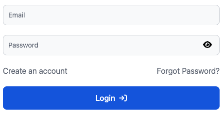
LoginForm
The LoginForm component provides a basic login form that includes an email field, a password field, and a login button by default.
Customization Options:
You can enhance the LoginForm by utilizing the following slots and props:
- Slots:
extra_inputs_top: Add any fields or components you want to display above the input fields.extra_inputs_bottom: Include additional fields or components below the input fields.secondary_links: Replace the default secondary links (like "Create an account" and "Forgot password?") configured in theauth.ymlfile with your custom content.loadingIcon: Override the default loading icon with your own.
| Name | Type | Description |
|---|---|---|
buttonBgColourClass | string | This is responsible to set the background color for the login button, it is "bg-primary text-[--settings-text-contrast-primary-color]" by default. |
iconColourClass | string | This is responsible to set the color of the icon on the login button, it is "#fff" by default. |
buttonExtraClass | string | This is responsible to set additional tailwind classes to the login button, it is empty string by default. |
successRedirect | string | This is responsible to redirect the user after a successful login, it is "/dashboard" by default, or whatever value you have in the auth.yml file, under ui.layout.login.redirect.success . |
showCreateAccount | boolean | This is responsible to display the create account link, it is false by default, or whatever value you have in the auth.yml file, under ui.layout.login.registration.enabled . |
showForgotPassword | boolean | This is responsible to display the forgot password link, it is false by default, or whatever value you have in the auth.yml file, under ui.layout.login.forgotPassword.enabled . |
validationSchema | yup.ISchema<any, any, any, any> | This is repsonsible for the forms yup validation schema object, it is only email and password by default. |
actionString | string | This is responsible to server side handling of the form submission, it is empty string by default. |
method | string | This is responsible to server side handling of the form submission, it is POST by default. |
SubmitBtnSize | string | This is responsible for the size of the login button, it is lg by default. |
onLogin | function | (values: any) => void | This is your async login function that will run when the user clicks on the login button. |
Event Dispatches:
The LoginForm also dispatches two events that you can listen to:
on:error: Triggered when a login attempt fails.on:success: Triggered upon a successful login.
These events allow you to handle login results effectively. When the user clicks the login button, the function provided in the onLogin prop is executed, and based on the outcome, either on:error or on:success is dispatched.
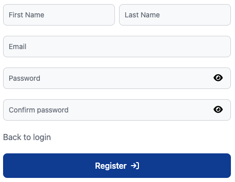
RegisterForm
The RegisterForm component provides a comprehensive registration form that includes fields for first name, last name, email, two password entries, and a register button by default.
Customization Options
You can enhance the RegisterForm by utilizing the following slots and props:
- Slots:
extra_inputs_top: Add any fields or components you want to display above the input fields.extra_inputs_bottom: Include additional fields or components below the input fields.secondary_links: Replace the default secondary links (such as "Back to login") configured in theauth.ymlfile with your custom content.loadingIcon: Override the default loading icon with your own.
Event Dispatches
The RegisterForm dispatches two events that you can listen to:
on:error: Triggered when a registration attempt fails.on:registration: Triggered upon a successful registration.
These events allow you to handle registration results effectively. When the user clicks the register button, the function provided in the onRegister prop is executed, and based on the outcome, either on:error or on:registration is dispatched.
| Name | Type | Description |
|---|---|---|
buttonBgColourClass | string | This is responsible to set the background color for the register button, it is "bg-primary text-[--settings-text-contrast-primary-color]" by default. |
iconColourClass | string | This is responsible to set the color of the icon on the register button, it is "#fff" by default. |
buttonExtraClass | string | This is responsible to set additional tailwind classes to the register button, it is empty string by default. |
successRedirect | string | This is responsible to redirect the user after a successful register, it is "/register" by default, or whatever value you have in the auth.yml file, under ui.layout.registration.redirect.success . |
showCreateAccount | boolean | This is responsible to display the create account link, it is false by default, or whatever value you have in the auth.yml file, under ui.layout.register.registration.enabled . |
passwordStrength | { minLength?: number, requireCapitalLetters?: boolean, requireNumber?: boolean, requireSpecialCharacters?: boolean } | This is responsible to validade teh password to pass the strength criteria, it is object by default, or whatever value you have in the auth.yml file, under ui.layout.registration.passwordStrength . |
validationSchema | yup.ISchema<any, any, any, any> | This is repsonsible for the forms yup validation schema object, it is only first_name, last_name, email, password, and confirm password by default. |
action | string | This is responsible to server side handling of the form submission, it is empty string by default. |
method | string | This is responsible to server side handling of the form submission, it is POST by default. |
SubmitBtnSize | string | This is responsible for the size of the register button, it is lg by default. |
onRegister | function | (values: any) => void | This is your async registration function that will run when the user clicks on the register button. |
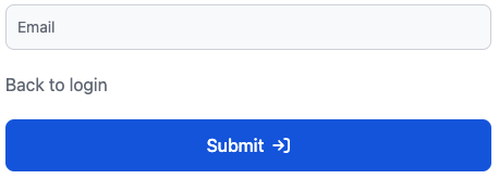
ForgotPassword
The ForgotPassword component provides a straightforward form for users to request a password reset. By default, it includes an email field and a submit button.
Customization Options
You can enhance the ForgotPassword component by utilizing the following slots and props:
- Slots:
extra_inputs_top: Add any fields or components you want to display above the input fields.extra_inputs_bottom: Include additional fields or components below the input fields.secondary_links: Replace the default secondary links (such as "Back to login") configured in theauth.ymlfile with your custom content.loadingIcon: Override the default loading icon with your own.
Event Dispatches
The ForgotPassword component dispatches two events that you can listen to:
on:error: Triggered when a forgot password request attempt fails.on:success: Triggered upon a successful forgot password request.
These events allow you to handle the results of the forgot password request effectively. When the user clicks the submit button, the function provided in the onForgotPassword prop is executed. Depending on the outcome, either on:error or on:success is dispatched.
| Name | Type | Description |
|---|---|---|
buttonBgColourClass | string | This is responsible to set the background color for the submit button, it is "bg-primary text-[--settings-text-contrast-primary-color]" by default. |
iconColourClass | string | This is responsible to set the color of the icon on the submit button, it is "#fff" by default. |
buttonExtraClass | string | This is responsible to set additional tailwind classes to the submit button, it is empty string by default. |
successRedirect | string | This is responsible to redirect the user after a successful submission, it is "/login" by default, or whatever value you have in the auth.yml file, under ui.layout.forgotPassword.redirect.success . |
displayForgotPassword | boolean | This is responsible to display the create account link, it is false by default, or whatever value you have in the auth.yml file, under ui.layout.forgotPassword.forgotPassword.enabled . |
validationSchema | yup.ISchema<any, any, any, any | This is repsonsible for the forms yup validation schema object, it is only email by default. |
actionString | string | This is responsible to server side handling of the form submission, it is empty string by default. |
method | string | This is responsible to server side handling of the form submission, it is POST by default. |
SubmitBtnSize | string | This is responsible for the size of the submit button, it is lg by default. |
onForgotPassword | function | (values: any) => void | This is your async registration function that will run when the user clicks on the submit button. |
Profile Components
These profile components are simple yet customizable components designed to display user information.
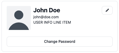
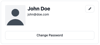
ProfileCard
The ProfileCard component is a comprehensive profile card that displays the user's name, email, and other relevant information. It also includes a "Change Password" button and an "Edit" button that modify the URL's search parameters.
The ProfileCard component also supports an avatar upload feature, allowing users to update their profile picture. This is handled through the profileAvatarUpdate function prop.
| Name | Type | Description |
|---|---|---|
tabs | Array<{name: string, id: string}> | This is an array of objects responsible to display all the tab options of the profile card, it is [{name: "Change Password", "change_password"}] by default. |
user | DirectusUser | This is the users object responsible to set user name and other user information, it is null by default. |
avatarLink | string | This is responsible to set avatar image on the card, it is null by default. |
profileAvatarUpdate | (file: File) => Promise<void> | This is the funtion that will be called when the user update a new avatar image. it is empty function by default. |
avatarContainerClass | string | This is repsonsible change the tailwind class of the avatar container, it is empty string by default. |
avatarClass | string | This is repsonsible change the tailwind class of the avatar element, it is empty string by default. |
profileHeaderContainerClass | string | This is repsonsible change the tailwind class of the users name header container, it is empty string by default. |
profileEmailContainerClass | string | This is repsonsible change the tailwind class of the users email info container, it is empty string by default. |
profileHeaderInfoClass | string | This is repsonsible change the tailwind class of the users name header text, it is empty string by default. |
profileEmailInfoClass | string | This is repsonsible change the tailwind class of the users email info text, it is empty string by default. |
editIcon | Record<string, string> | This is responsible for the edit button icon, it is ["fas", "pencil"] by default. |
actionButtonsColor | string | This is responsible for color of the action buttons on the card, it is "alternative" by default. |
ProfileCard Slots
card-leadprofile-info-header-leadprofile-info-leadprofile-info-trailtabs-leadtabs-trailcard-trail
 ### ProfileUserInfoLine
 The ProfileUserInfoLine component is a simple line component intended to be used as a slot within the ProfileCard component. It displays a piece of user information with an optional icon.
| Name | Type | Description |
|---|---|---|
information | string | This is responsible to set the text to be displayed on the line, it is empty string by default. |
informationClass | string | This is responsible to set tailwind classes to the text to be displayed on the line, it is empty string by default. |
type | "heading" | "text" | This is responsible to set type of text to be displayed on the line, either a text or a heading, it is heading by default. |
displayIcon | boolean | This is responsible to display or not a fontawesome icon element, it is false by default. |
icon | Record<string, string> | This is responsible to set what fontawesome icon to be displayed on the line, it is ["fas", "envelope"] by default. |